Personal Logo Development
- Serena Toovey

- Apr 22, 2020
- 1 min read
Updated: Jun 14, 2020
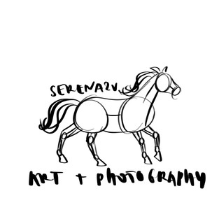
Developing logo ideas. The final logo is still to be decided however I have used the line art logo on a lot of my work, from my business cards to my Instagram information. I have been hesitant to commit to a logo as I love my Instagram and blog profile picture so much.
Rough sketches and line art of a horse cantering.


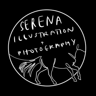
Silhouette of the rough sketch with text cut out. Serstiel is my username on a lot of websites and I wondered whether I could incorporate this into my brand.


Cantering horse made into an abstract graphic. This could be a cool idea if executed correctly.


I developed the cantering horse into single line art. I then developed if further to look neater. I experimented with adding text to fill in the line of the back and neck. I love how this looks however it is not easy to read. I introduced a circle and then a semi-circle shape and it ended up resembling a rocking horse. This looks really nice, however, it does not fit my brand. It would work well for a children's equestrian clothing or toy company. For my logo, I would prefer one from the first row.


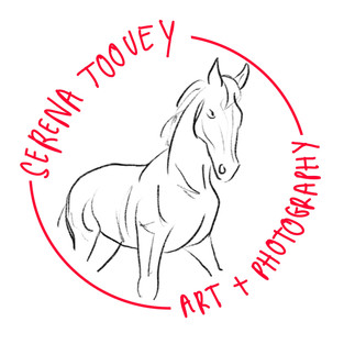
I developed the sketch into line art, and again into a silhouette. I then experimented with different fonts and styles and made a range of logos from harsh to soft. I really like all three of these but don't know if they are unique enough.


I neatened the circle concept. I experimented further with symmetry and added lines and shapes. These look more like a logo seen on a high fashion bag rather than an illustrators logo.


Comments